Wednesday 28 November 2012

David Hockney


David Hockney (born 9 July 1937) is an English painter, draughtsman, print maker  stage designer and photographer.     He has a home in both Yorkshire and London as well as two residences in America. 

He was an important contributor to the Pop art movement of the 1960's and is considered one of the most influential British Artists of the 20th century.

Throughout his life he made prints, portraits of friends and stage designs for various important theaters. 

Hockney Painting

Hockney was born with synesthesia, a condition that means he sees colours when hearing music.  In general he does not use this in his painting or photography.  He did however use it when making sets for various ballets and operas, where he based the colour schemes on the colours he saw whilst listening to the music of the theater piece.

TURANDOT — Set design by David Hockney
He also worked with photography, or, more precisely  photo collage.  Using a varying number of small Polaroid photographs of a single thing; Hockney would then arrange a patchwork of composite images.  One of the first of these images was of his mother.
Because the pictures are all taken from different perspectives and at slightly different times, the result is that it has a similar look to Cubism.

Hockney created these works mostly between 1970 and 1986.  He called them "joiners".  He created these pieces by taking multiple photographs of one subject and arranged them into a grid layout. 
His A Bigger Grand Canyon, is a series of 60 paintings that combine to make one huge picture.  It was bought by the National Gallery of Australia for $4.6 million.  


However one of his most iconic pieces, The Splash fetched a huge £2.6 million, which was the record for one of his paintings.
Since 2009, Hockney has painted hundreds of portraits, still lifes and landscapes using, Brushes on the iPhone and iPad, often sending them to his friends.  He now has gallery exhibitions of iPads and iPods showing his new work.  

Warhol It!


Week three of the Introduction to Pop Art section of Art Club focuses on the art of Andy Warhol.

Warhol is most famous for his print work capturing popular products and icons.

Once you have had a look at Andy Warhol's information, follow these steps:

Step 1

Fold your paper evenly into 4


Step 2

Draw a portrait of your favourite icon into one section; like you learnt in lesson 1.

Don't forget to use reference!

Take up the whole of that section, like so:


Step 3

Ink it with an outlining pen, not a ball point pen!


Step 4

Either get a sheet of tracing paper or another piece of plain paper and copy your portrait three times.

One into each box. 


Step 5

Now with a felt tip pen or good firm pencil work; colour in each box a different colour.


Then you are done!

Good job! 


Now if you want to test yourself, try colouring a set in two or three colours a section.


Or how about drawing your favourite food product or item at home.

I drew (digitally painted) a bottle of coke.


Friday 23 November 2012

Andy Warhol

 
Andy Warhol (August 6, 1928 – February 22, 1987) was an American artist who was a leading figure in the visual art movement known as pop art. His works explore the relationship between artistic expression, celebrity culture and advertisement that flourished by the 1960s. After a successful career as a commercial illustrator, Warhol became a renowned and sometimes controversial artist.
 
Warhol's art encompassed many forms of media, including hand drawing, painting, printmaking, photography, silk screening, sculpture, film, and music. He was also a pioneer in computer-generated art using Amiga computers that were introduced in 1984, two years before his death.
 
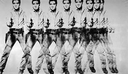
Many of his creations are very collectible and highly valuable. The highest price ever paid for a Warhol painting is US$100 million for a 1963 canvas titled Eight Elvises.
 
File:Eight Elvises.jpg
 
In the 1960's Warhol decided to paint daily objects that were mass produced, such as coke bottles and soup cans.  He also liked to paint famous people.
 
 
He started a place called The Factory where he mass produced his artwork in the form of prints. 
Mickey Mouse Art Print
 Odd facts about Warhol
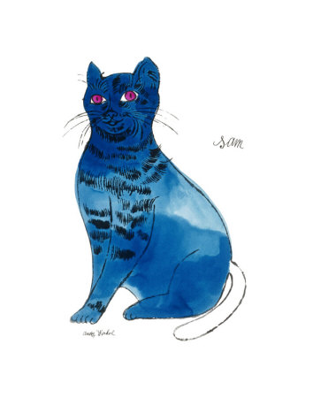
  • He liked cats and made many pictures of them.
  • He made a film called Sleep that was a recording of a man sleeping for six hours.
  • In 1968 he nearly died after being shot three times by a woman named Valerie Solanas.
  • He was very religious and volunteered at homeless shelters.
25 Cats Named Sam and One Blue Pussy by Andy Warhol, c.1954 (Blue Sam) Art Print

Wednesday 21 November 2012

Ben-Day Dot Activity


Last year I taught a series of lessons on Pop Art.

One of the intro lessons involved the use of Ben-Day dots.

The second session of this years Art Club is this very same activity as it was successful before.

Take a look at these pictures that I drew last year:


All three of these use Ben-Day dots and bold solid colour.  All three are figures chosen by the children of last years classes, as they were their favourite icons.

If you have not seen it already check out Roy Lichtenstein and Benjamin Henry Day, Jr. You will then be able to see the history behind the art style, both in medium and its invention.

Through the use of Ben-Day dots you can make blocks of colour.  If you use coloured dots close together it makes a more solid colour, however if you use them further apart it makes a lighter colour.  Eg: Red dots close together will make a red, whereas if they are further apart it will make a fleshy tone instead.

I put it to vote again this year and the three most popular popular icons I drew up as templates.

Here they are:

Justin Beiber

Psy

Rhianna


Now your task is to colour one of them using a mixture of block colour and Ben-Day dots.   Try to use Ben-Day dots for the skin and background.

Things to keep in mind.
  • Try to stick to only a few colours.  Lichtenstein stuck to generally 3 yellow, blue and red (sometimes green)
  • Ben-Day dots in one section stay the same size and colour.
  • All dots use the same pattern, look at it closely, use a ruler if it helps.
  • All dots in one section are equally spaced apart from each other.
  • Be creative, make it stand out!
  • Pop Art is about simplicity, eye catching icons and impact.  Don't be too fussy with details.  
  • Think bold and think big.
  • Take care with your colouring and make it as good as you can.

Good work!  Keep it up!


Benjamin Henry Day, Jr and Ben-Day Dots

Benjamin Henry Day, Jr. (1838-1916) was an illustrator and printer, best known for his invention of Ben-Day dots.

Day was the son of Benjamin Day, an American newspaper publisher best known founding the New York Sun, the first penny press newspaper in the United States, in 1833.

An example of Ben-Day dots (Benjamin Henry Day never actually worked on the Snoopy cartoons)

The Ben-Day dots printing process is similar to pointillism.  Depending on the effect, colour and optical illusion needed, small coloured dots are placed together, widely spaced or overlapping.

For example red dots widely spaced create pink whereas closely spaced red dots look like a deep red.

Pulp comic books of the 1950's and 1960's used Ben-Day dots in the four process colours (cyan, magenta, yellow and black) to cheaply create shading and secondary colours such as green, orange and flesh colours.

Ben-Day dots are always of equal size and distribution in a specific area.  To put the dots into a drawing, the artist would buy the sheets from a stationary shop.  Sheets were available in various size and distribution, which gave the artist a choice of what tones that wanted to use.

Ben-Day dots were considered to be the signature of the American artist Roy Lichtenstein, who enlarged and exaggerated them in many of his paintings and sculptures.

Many other artists still use them today.  The overlay sheets are still used by  print and by comic artists today.

Tuesday 20 November 2012

A Brief Introduction to Roy Lichtenstein


Roy Lichtenstein (1923-1997) was one of pop art's most inspired and successful creators.  His first piece of this style was in 1961 when he painted Look Mickey:


After this he painted a range of pieces based on comic strips and newspaper ads, it was through these that he developed his signature style.

Keds (1961)

Popeye (1961)

A study of Goldfish Bowl and Painting of a Golf Ball (1972)

His drawings span two decades and range in date from 1973 to 1992.  They cover still life to abstraction, architecture to surrealism, German expressionism to landscape and women to interiors.

Interior with Mobile (1992)

Lichtenstein's style was mainly graphic and he relied on his drawing skills.

He used an opaque projector to cast the image of a drawing onto canvas, and then that image would then be the start of the painting.

Unlike the cool and mechanical look of the paintings, there is a real warmth in his drawings.

Lichtenstein stated that: "the drawings show the real work...[and] are the basis of my art."  "everything is in the drawings."

Without a good starting point you cannot hope to come up with a masterpiece.  So practice, be creative and maybe you one day you can also become a famous artist.


Torpedo LOS (1963)

Hopeless (1963)